Projekt: With this commission I was fortunate enough to work on something that really speaks to my heart and soul.
Ozeankind e.V. is a two-person organisation that made it their goal to fight ocean pollution - especially from plastic waste. They educate about the issue of plastic pollution and motivate people to take action themselves, and how the tiniest right decision in our daily lives can help make a difference. They organise worldwide clean-up days. People from all over the world take part and post the result of their picking up trash on social media with the hashtag #plastikrebell - which became so popular that it recently earned it's own blog to give the community even more power.
So much for the background.
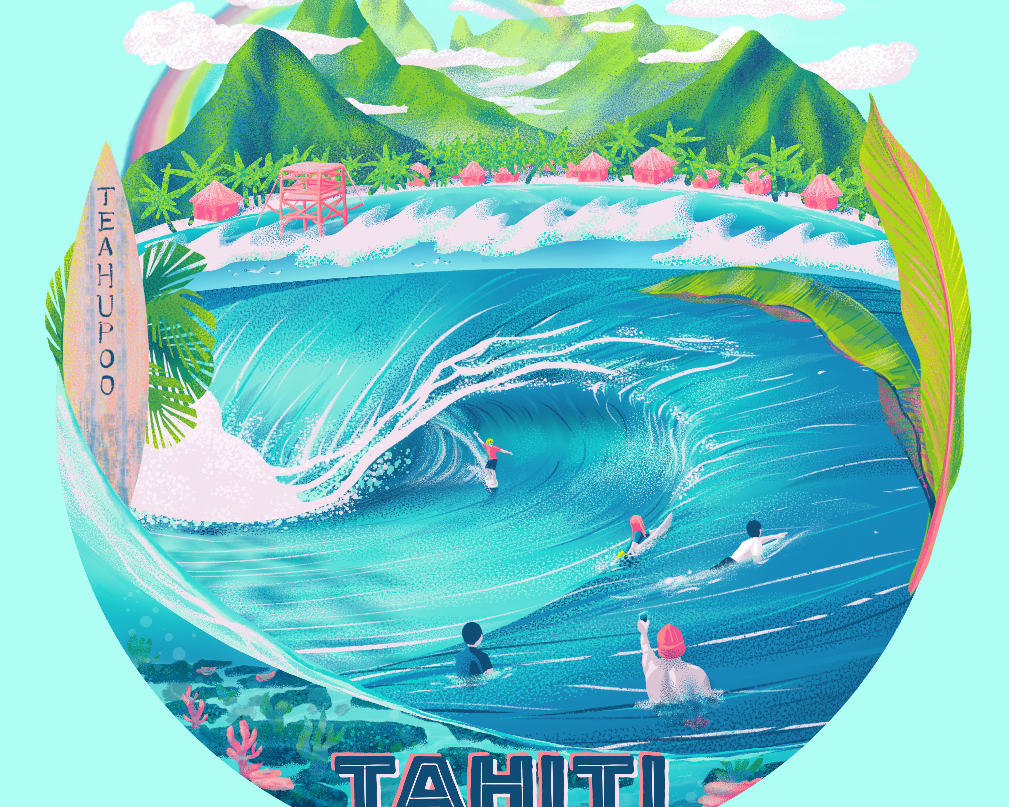
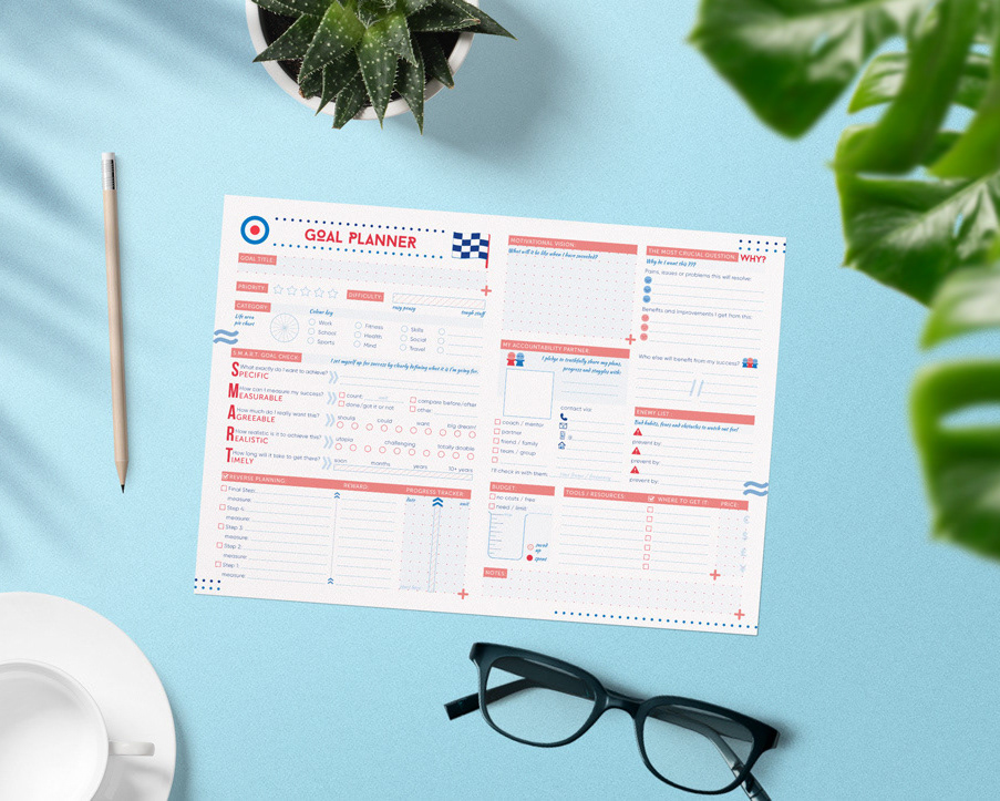
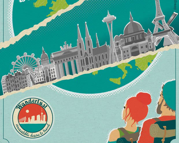
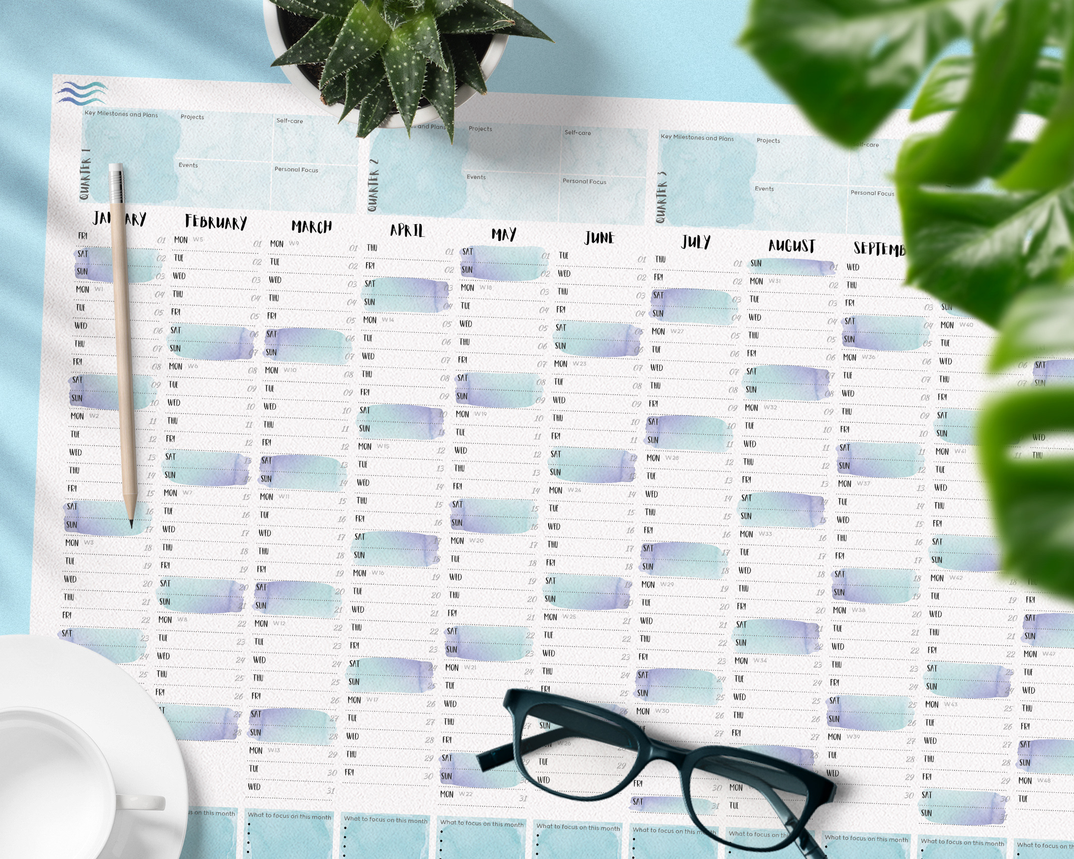
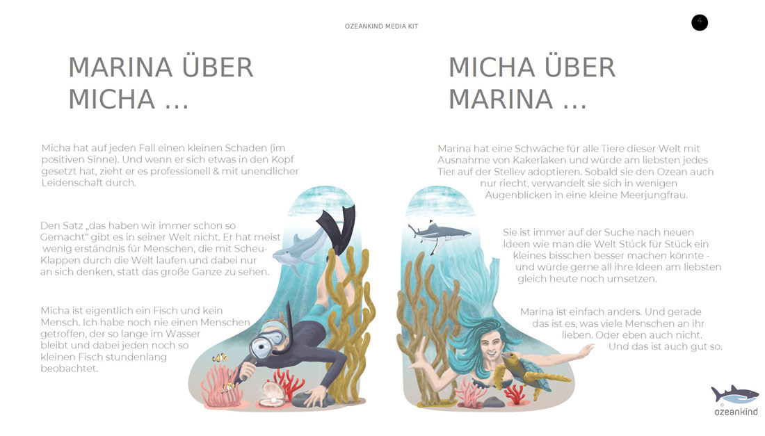
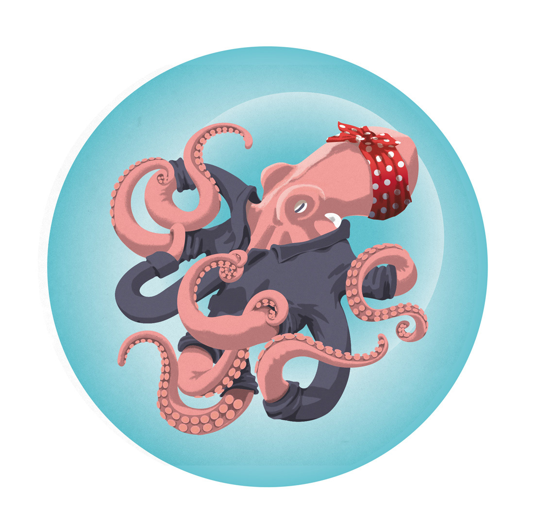
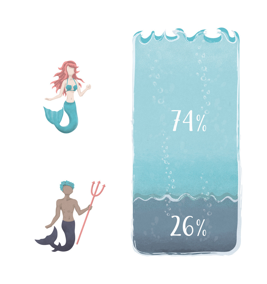
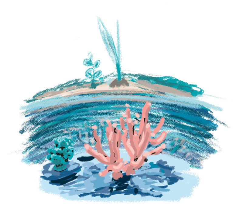
For the project I was asked to create some illustrations, that would give their organisation's presentation a bit more life and show their quirkiness. Basically I was given a lot of freedom in terms of how much and what parts to illustrate.
I took the chance to try out a different style of digital illustration. I've been wanting to practice different styles and workflows for a while, so in this project I dared to practice while working. That meant a lot of trial&error as well as waaaaay too many working hours. But it was a fun commission and the result was highly appreciated.
My personal critique (am I supposed to critique my work in my portfolio? -most likely NOT! - but I'll do it anyway, because I want to stay honest) is that the illustrations lack consistency. The reason for that is what I mentioned before: they were part of my venturing out into different styles - so the progress between first and last illustration is definitely visible (images below are not in chronological order, though)
Client: Ozeankind e.V. - ozeankind.de
Format: various sized illustrations for a digital media-kit (in form of a presentation)
Tools: Adobe Illustrator, Adobe Photoshop - Sketching: Uni-pin pens, pencil, Promaker
presentation pages
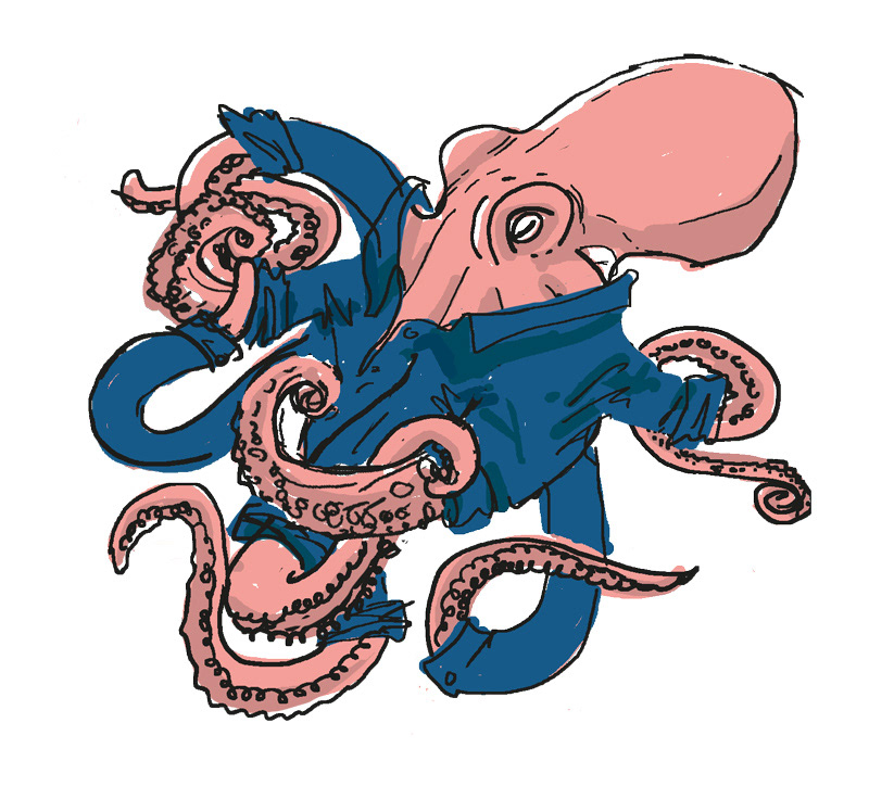
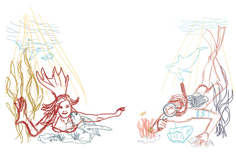
some of the digital sketches
Thanks for viewing!
